Extend Form Designer
vue-form-craft provides some basic components, such as input, select, and radio.
However, sometimes these components may not fully meet our business needs. In such cases, we can consider extending the form designer of vue-form-craft with more draggable components to meet additional requirements and facilitate future use!
How to Extend?
Simply register vue-form-craft globally and pass in an extendElements configuration!
extendElements is an object! The component name serves as the key, and FormElement serves as the value!
type extendElements = { [key: string]: FormElement }// main.ts
import { createApp } from 'vue'
import App from './App.vue'
import ElementPlus from 'element-plus'
import 'element-plus/dist/index.css'
import VueFormCraft from 'vue-form-craft'
import extendElements from './extendElements'
const app = createApp(App)
app.use(ElementPlus)
app.use(VueFormCraft, { extendElements })
app.mount('#app')FormElement Object
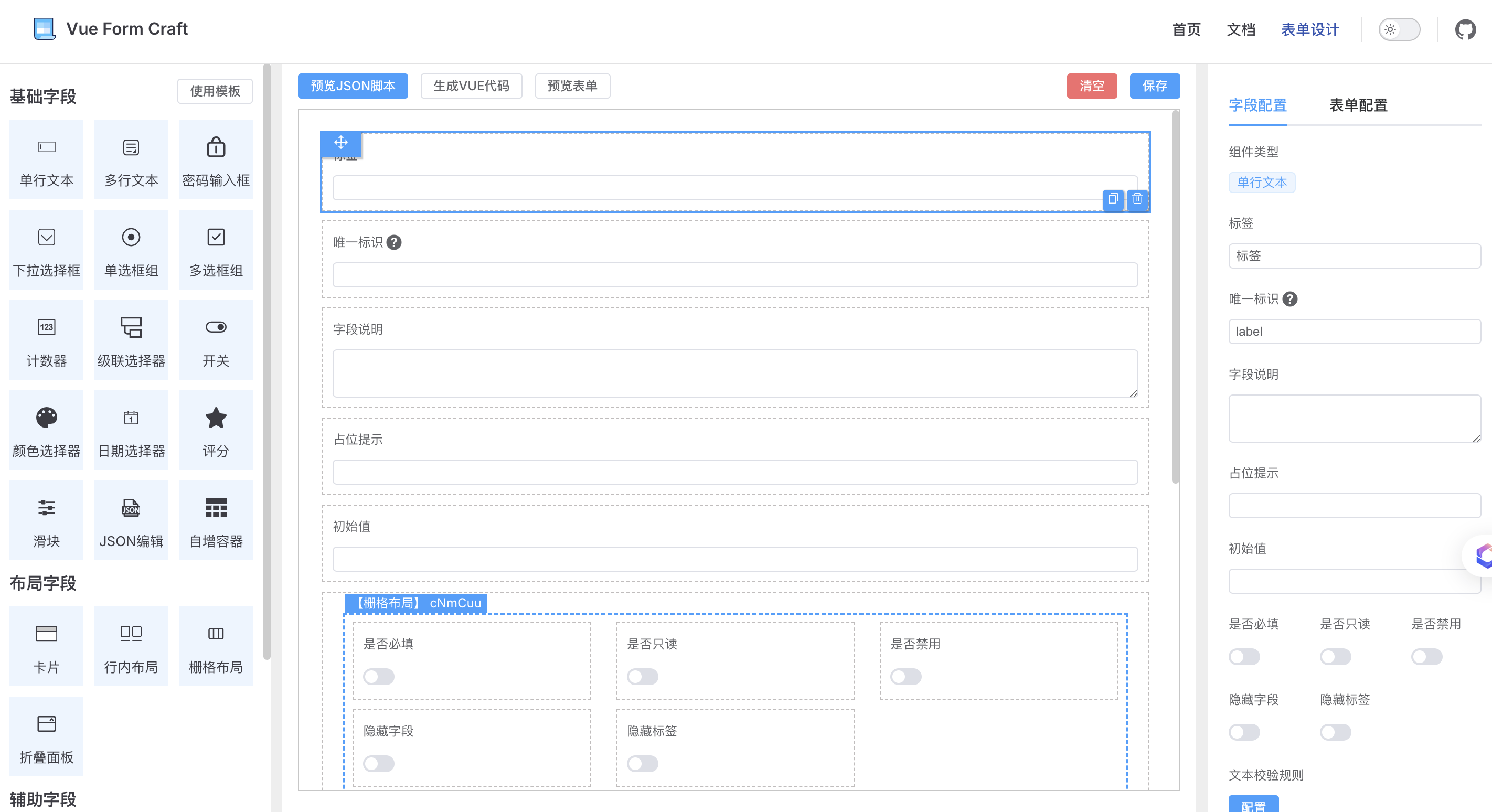
The components in the form designer are all composed of FormElement objects. Similarly, if we want to extend more components, we need to configure them according to the interface format of FormElement and then pass them to vue-form-craft!
interface FormElement {
  name: string
  component: VNode | Component
  icon: VNode | Component
  type: 'assist' | 'layout' | 'basic'
  order: number
  initialValues: Omit<FormItemType, 'name'>
  modelName?: string
  attrSchema: FormSchema
}
Below is a detailed description of each property of FormElement:
name
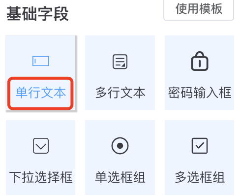
The component name, which appears on the left sidebar of the designer as the name of a specific component.

icon
The component icon, which appears on the left sidebar of the designer as the icon of a specific component.
The icon format is a Vue Single-File Component.
![]()
component
The Vue Single-File Component used to render the component.
type
The component type, which determines the category in the left menu where the component appears. If type='basic', the component should be able to accept v-model.
order
The components in the left menu are sorted based on the order value.
initialValues
When a component is dragged and generated, this field is added as the default configuration in the schema's items.
The form on the right side of the designer actually edits this parameter!
modelName
The v-model name passed to the component. The default is modelValue.
attrSchema
The schema for the component's configuration form.
Corresponds to the configuration form on the right side of the designer. It is recommended to use the designer to drag and generate!
